One of the primary tools used in technical analysis is price charts. A chart is a graphical representation of data. In this article, we take a deeper look at what price charts and candlestick patterns are.
What is a Price Chart?
A price chart is a graphical representation of the price and volume data of a stock/security. It helps us visualise the price movement to understand it better. Before price charts, participants had to watch the screen for hours and try to remember the important price levels at different points in time which was practically impossible. This led to the use of price charts.
What are Line Charts?
Line charts are the oldest form of price charts. It is a simple graphic display of price trends over time. Line charts are typically drawn with closing prices as the data points. The closing price refers to the price at which the last trade of the trading session occurred. Many consider it one of the most important data points as it signifies the financial decision for the trading session or period. The closing prices can be of any time frame such as hourly, daily, weekly, monthly, or yearly.
The vertical axis or Y-axis represents the price level and the horizontal axis or X-axis represents time.
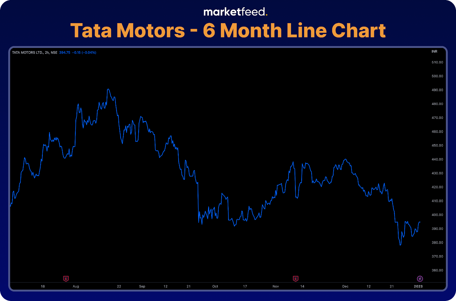
The line chart above shows the previous 6-month price data of Tata Motors. Each data point represents the closing price of 2-hour timeframes. If we observe, the price of Tata motors fell from 490 in mid-august. This chart shows the trend of prices in the last 6 months.
Even though a line chart portrays the data in a simple way, it only considers a single data point, the closing price. The Japanese invented an alternative to the line chart known as the Candlestick Chart, which utilises four different data points.
What are Candlestick Charts?
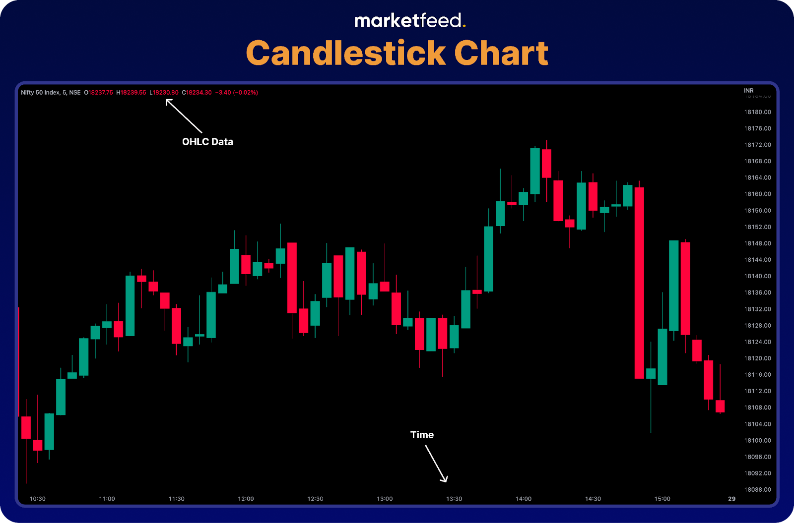
The Japanese invented candlestick charts, and they have been utilising technical analysis for centuries. A candlestick chart is a type of price chart that provides four prices per data point, the opening and closing prices and the high and low prices during a period. These prices can be called OHLC data in short which stands for Open, High, Low, and Close, respectively.
In addition to the four prices, the candlesticks also portray the emotions of the investors and traders, which we will learn how to interpret later in this chapter. The greatest advantage to using candles on your charts is that single candle lines and multiple candle patterns offer more reliable, earlier, and more effective reversal signals.
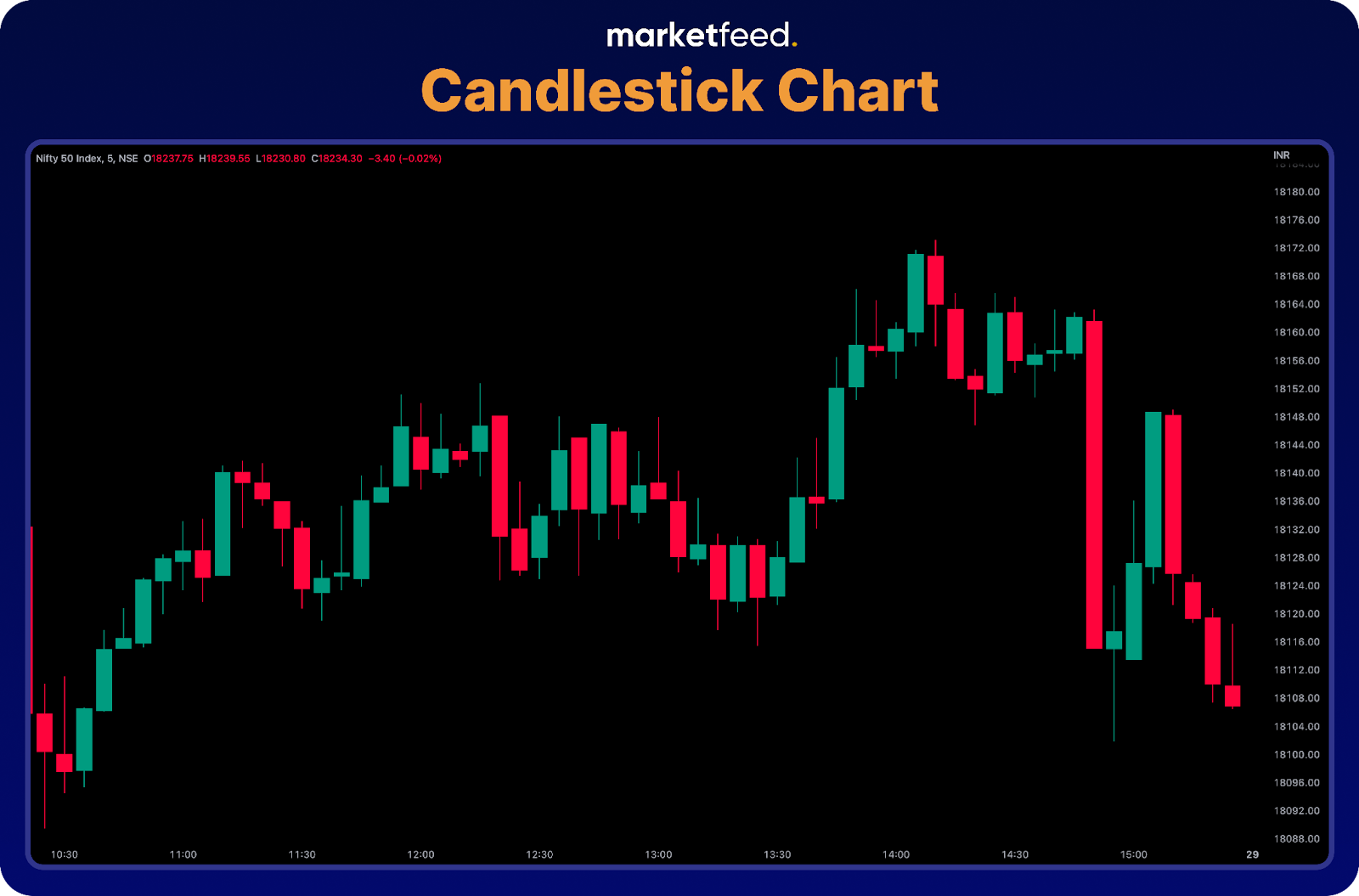
Candlesticks form candlestick charts. A candle shows the price movement of a security during a fixed period through the OHLC data. Bullish (green) candles and Bearish (red) candles are the two types of candles.
Structure of Candle Sticks
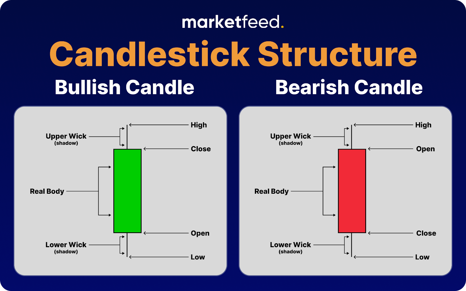
A Candlestick Shows Four Prices:
- Open – The price at which the asset started trading at in the timeframe.
- High – The highest price at which the asset was traded.
- Low – The lowest price at which the asset was traded.
- Close – The price at which the asset was traded at the end of the time frame. The LTP of the timeframe will be the closing price.
The Three Parts of a Candlestick Are:
- The central real body – It is a rectangular shape that connects the opening and closing prices.
- Upper shadow – Indicates the high
- Lower shadow – Indicates the low
A candlestick is in the form of a rectangle with wicks at both ends. The rectangle is called the central real body and connects the opening and closing price. The upper shadow (wick) indicates the high, and the lower shadow (wick) indicates the low. Both the wicks are connected to either side of the central real body.
A candle only reaches its final form once the timeframe ends. A 5-minute candle starts forming at the beginning of the 5 minutes, and the close of the candle keeps changing depending on the price fluctuations. The price at which the last transaction in the 5 minutes took place will be the closing price. The two types of candles are based on the opening and closing price of the candle.
What are Bullish Candles?
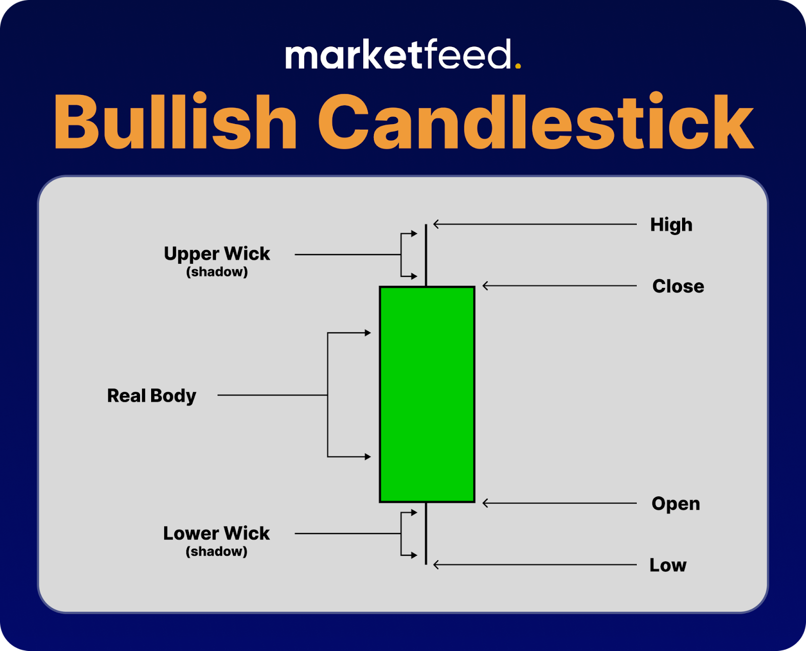
If the closing price is higher than the opening price, it is known as a Bullish or green candle. The closing price will only be higher than the opening price only if buying takes place. Therefore, a green or bullish candle symbolizes buying, which means there will be an increase in the price of the security.
What are Bearish Candles?
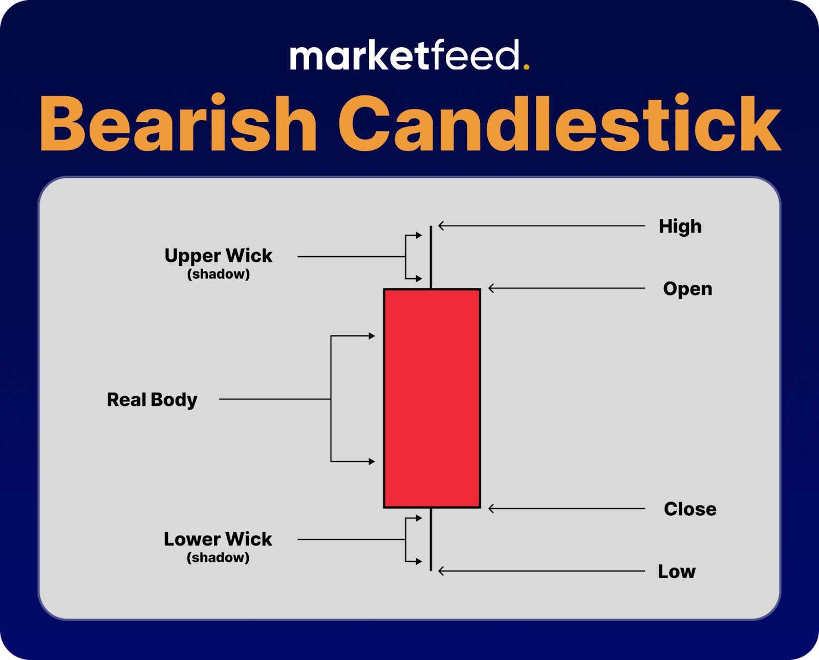
If the closing price is lower than the opening price, it is known as a Bearish or red candle. The closing price will only be lower than the opening price only if selling takes place. Therefore, a red or bearish candle symbolizes selling, which means there will be a decrease in the price of the security.
Let us look at some bullish and bearish candles in action:
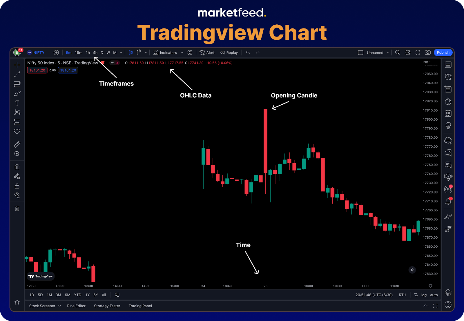
Timeframe refers to the duration of each candle. You can change it from the menu on top of the window. The chart will display the OHLC data of the highlighted candle at the top. Here, the highlighted candle is the first 5-minute candle of 25th October 2022. You can move the cursor to select and highlight a candle, allowing you to view its OHLC data. The time and date are shown at the bottom of the chart.
If you look at the opening candle, you can see that the candle has no upper wick. This means that the opening price of the candle is the same as the high that the price made in that time frame and hence no upper wick. It says that the price fell as soon as the candle opened.
As an exercise, you can load up a chart on TradingView or in your broker’s terminal and try to understand the candlesticks by checking its OHLC data. Also, try changing the timeframes to see how the price action was in a selected timeframe.
Types of Single Candlestick Patterns
As you may have noticed, each candle is unique but of similar types. Some have a bigger body, some have longer wicks, and some with shorter wicks as well. Based on the structure of the body and the wick, candlesticks can be of the following types:
1. Marubozu
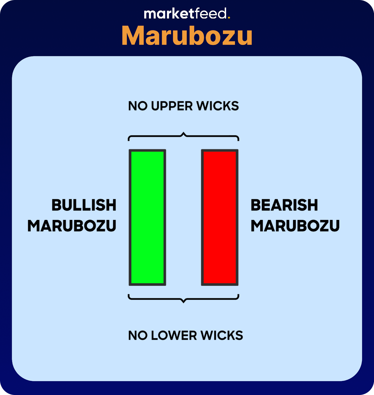
A marubozu is a candlestick with no upper or lower wicks. This type of candle indicates a strong trend.
- Bullish Marubozu – It is a clean buying candle, which started moving up from the opening level and closed at the highest point. Open = Low and Close = High
- Bearish Marubozu – It is a clean-selling candle, which started moving up from the opening level and closed at the highest point. Open = High and Close = Low
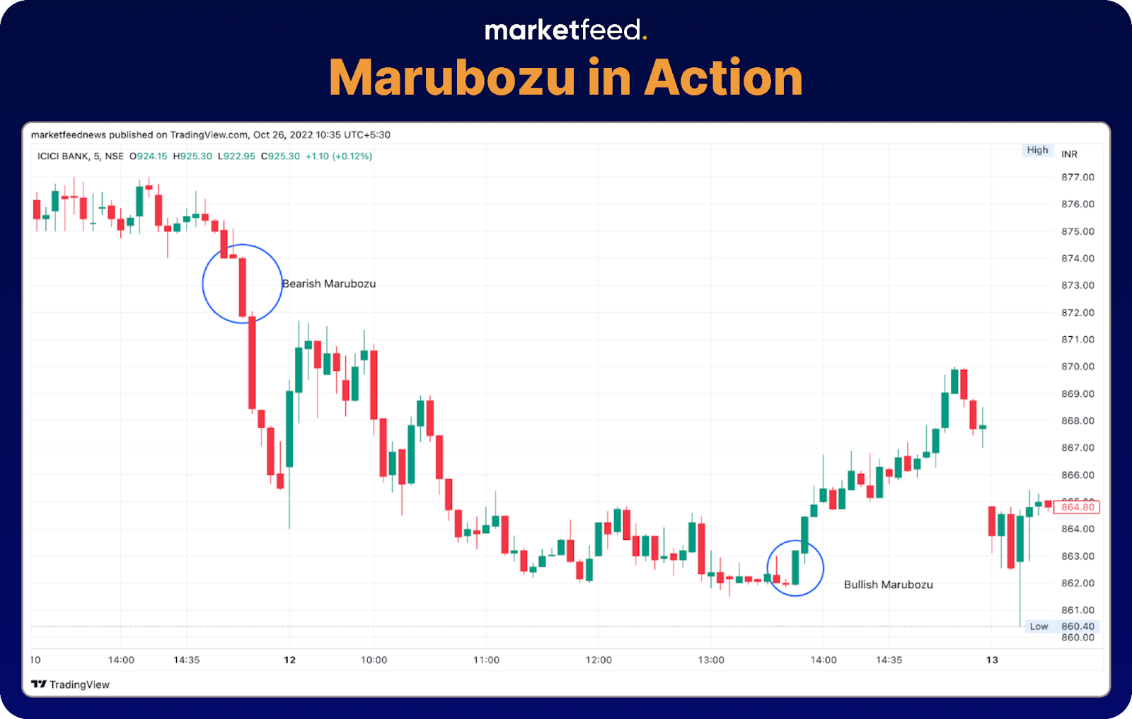
The candles marked in the above chart has very short wicks, which can be ignored.
2. Spinning Tops

As the name indicates, this type of candle looks like a spinning top and indicates indecision, consolidation, or even trend reversal. These candles have a small real body and almost equal upper and lower wicks. The colour of the body does not matter as it is small.
- A spinning top in a downtrend signals that sellers are getting tired and there is a chance for reversal or consolidation and there could be buying front the bottom.
- A spinning top in an uptrend signals that the buyers are getting tired and there is a chance for reversal or consolidation and there could be selling from the top.

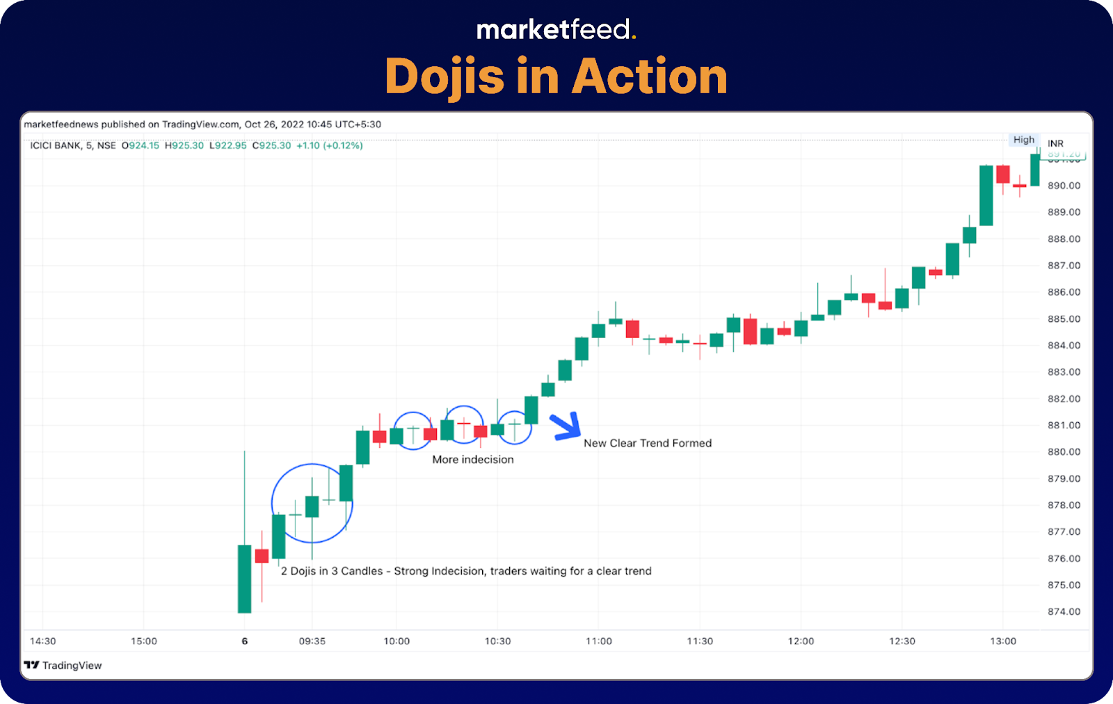
3. Doji Candles
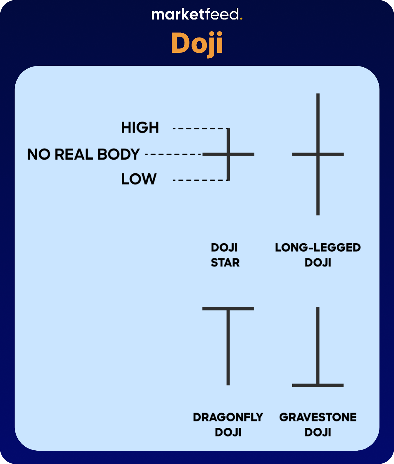
It is very similar to a spinning top, except that it has no real body. Open = Close. The upper and lower wicks might be of different lengths. It indicates extreme indecision and possible trend reversal. The types of doji candles are:
- Doji Star – It has small wicks.
- Long-legged Doji – It has longer wicks.
- Dragonfly Doji – It only has a lower wick and no real body.
- Gravestone Doji – It only has an upper wick and no real body.
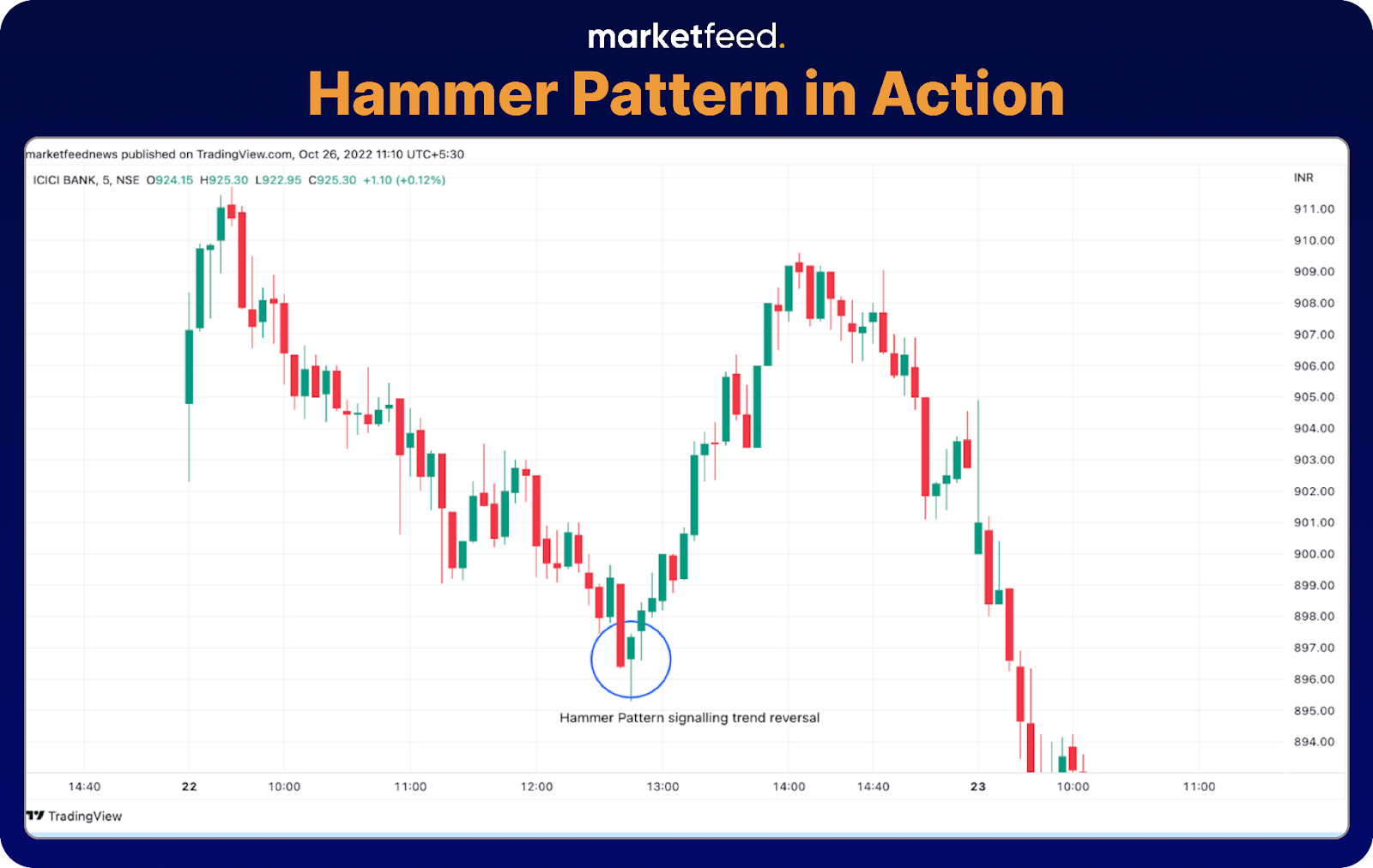
4. Hammer
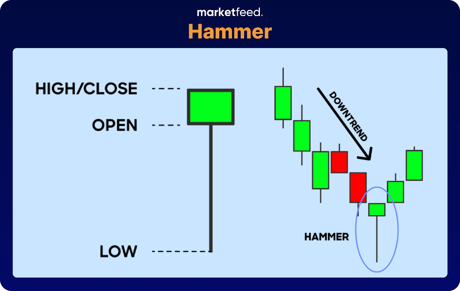
A hammer pattern forms at the bottom of a downward rally.
- They are indicated by a small upper real body and long lower wick.
- The length of the lower wick should be around twice as much as the length of the real body.
- The colour of the body does not matter.
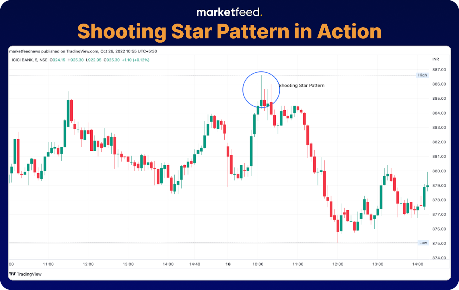
5. Shooting Star
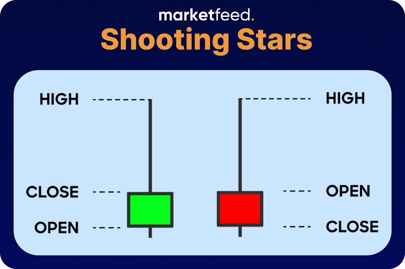
It indicates the end of bullishness at the top of a rally.
- It has a small lower body and a long upper wick
- The longer the wick, the higher the bearishness
- The color of the candle does not matter, but it is more reliable if it is a red candle
In this article, we learnt what line charts and candlestick charts are. They provide valuable insights into market trends and sentiment. This article serves as a beginner’s guide to analysing candlestick charts and exploring various patterns that help decipher market movements. It’s a great starting point to enhance your understanding and explore the fascinating world of chart analysis.